The Last Gasp

As you know by now, I think we are in the final stages of the topping process in major markets.  This is going to be a multi-month affair.  I suspect the top and crash begins later next year, but so do many other pundits, pros, and bloggers which makes me leery.  There’s nothing worse than contrarian consensus by large groups in the game of speculation.

Like its predecessors, the crash won’t look like one at first.  Sure, players will get scared and react but then we’ll see a bounce off the first initial move to the downside.  This will be an opportune time to liquidate positions to make a final cash raise to either capitalize during the crash or wait for the inevitable value opportunities that will arise.

There is a set of indicators that go along with this move downward and bounce that has proven efficacy as a guide.  It’s the 5 month and 10 month Exponential Moving Average (“EMA”).  Observe.

SPX - 5 & 10 Crossover (10-10-2016)

These aren’t magic indicators.  I’m not saying they are guaranteed to work.  I’m only saying they’ve proven themselves as guides when a real bear move has begun.  There are a multitude of economic and financial indicators that I also like to use along with anecdotal evidence, too.  Keeping an eye on this particular set of EMAs however can potentially keep your losses to between 10% and 15%, assuming you act.

In a bear market where there’s the potential for a halving of portfolios, I’d say 15% in losses is solid.

Volatility in the biggest asset classes will be unimaginable.  The algorithmic, high frequency trading operations in combination with central banks have broken all markets.  There will be no liquidity for the big timers when the bear begins.

HFTs are the true market makers and all algorithms are written to pull away and sell when bottoms fall out of markets.  Look at the S&P 500 in May of 2010.  That was really the first indication that markets would never liquidate in a typical fashion ever again, until HFTs are properly regulated, taxed, or removed from existence in markets.

There are plenty of examples between May of 2010 and now, but the move in the pound sterling at the start of October provides such a fine illustration.  What’s more liquid than the currency markets of the most developed and powerful Western nations?

Nothing.  And yet still we see the destructive power of HFT on any market.  Does this look normal in a power currency?

Sterling Madness (10-16-2016)

In earlier Asian trading, the intraday damage was even worse.  Observe this bit of madness.

image

These moves are a product of liquidity being immediately vacuumed from the asset classes where all the largest players play.  This will happen again and again when the markets make their final turn.

You can liken it to a hull breach for an astronaut in space without a suit on.  One second astronaut HYG is floating around the lab in a jump suit, happily conducting experiments with OPM.  But OPM in high-yield instruments in a low-yield environment can be a volatile material if not handled appropriately in a proper setting and an explosion occurs breaching the hull, sucking HYG out into the liquidity-free vacuum immediately to death.

Did I say liquidity?  I meant oxygen.

You get the point.

Coming back to what a last gasp means; it means there will be a final run in risk assets to squeeze out the final profits of this bull.  Many, including myself, have called it a melt-up, but I grow weary of the term.

Please don’t be fooled by some of the ignorance being freely proffered out there that we are in the early years of a cyclical bull, similar to 1982.  We are not.  The evidence is broad, clear, deep, and obvious.  One needn’t a fancy finance degree or years managing wealth in order to see this.

The end game is here, but not before that last gasp for profits that I keep describing.  I suspect that many of the sectors that powered this bull market prior to 2016 may reassert themselves to take us home.  Why is that?

Interest rates.  Plain and simple.

Those with access to leverage at these historically low rates will borrow capital to fund buyouts and takeovers which will drive asset prices upward.  The upward move will then draw in speculators looking to hop on the trend or front-run it.  This quest for yield whether in debt, equity, or private equity i.e. IRR, will be the fuel for the last gasp up in asset prices.

Despite what I think may happen in semiconductors or social or biotech or emerging markets as risk-on gains speed, keep your eyes on the one asset class that has taken out all comers in 2016.  The Rocky Balboa asset class for the year.  You know what I’m referring to and this is even with the recent sell-off.

2016 Performance Chart (10-16-2016)

Precious metals.  You don’t have to love them or hate them.  Opinions don’t have to be binary.  Be agnostic when speculating.  Follow the trends.  Follow the money.  More importantly, follow central banking and political lunacy.

Let’s look at one more chart that potentially validates that this bull market is long in the tooth.  It depicts the times over the last 50 years when payouts to equity investors have exceeded  profits.

Total Payouts via ZH (10-11-2016)

You can ignore what is glaringly obvious or you can prepare.

Speaking of obvious, let’s begin to wrap this post up with another pithy little ditty of a quote, this time from one of the world’s great speculators.  It’s been reprinted time and again, but it’s simple yet brilliant message is timeless.

I just wait until there is money lying in the corner, and all I have to do is go over there and pick it up.  I do nothing in the meantime.

– Jim Rogers

I haven’t touched on trading since the summer and I just wanted to share some set-ups that appear to potentially be building little piles of money in a corner waiting to be picked up.

Keep an eye on these sectors, either short or long:

Short:  sugar, energy(big 3), US dollar, and technology

Long:  grains, bouncing precious metals, and the pound sterling

Despite your opinions, never forget about counter-trend rallies, even in the face of what appears to be an unstoppable trend.

Financial System Liquidity–“When the Fun Stops”

At the end of my last post I stated I wanted to cover the,

…banking system and how it will exacerbate the shock to the financial system when whatever sovereign does what it’s going to do.  Specifically, I’ll expound on liquidity.  How it works and why every pro in the world already knows the danger it presents when it dries up.

For an outstanding and general explanation of liquidity within a market system, have a read of the excellent March 2015 piece, Liquidity, by Howard Marks.  He shares simple but keen insights on liquidity’s functionality across the entire financial market eco-system.  The masters always make the difficult seem simple.

The liquidity I’ll be referring to is really more akin to leverage and it’s how a significant percentage of the party is funded in the investment world between banks, asset managers, pension funds, insurance companies, corporations, hedge funds, and various other entities.

Let’s start with what I suspect to be the average opinion of how a financial layperson thinks the system works.

The financial layperson thinks the investment world takes in cash and assets from clients or customers and then redirects those resources into investments for the benefit of everyone involved.  On the surface, it is that simple.  Bank takes in customer deposit, then lends out cash at a premium.  Asset manager takes in customer investment capital, redeploys into assets with an expected ROI.

But for those in the know, there’s a much more sophisticated game played behind that simple perception.  The game of lending and insurance but under a different name called derivatives, specifically swaps and repos.  Observe how the financial world actually works, courtesy of the Office of Financial Research.

imageEven if you don’t understand all the components or every aspect of the diagram, the complexity and interconnectivity should jump right out at you.  “Securities Dealers” and “Broker-Dealers” are essentially just banks.  Major banks.  Systemically important banks.

What this diagram maps out is how the financial system constantly redeploys other people’s money (“OPM”) to eke out additional yield or lever up on a “winning” thesis.  This system diagramed above is the direct result of rocket scientists, PhDs, and all other people too smart by half taking their game to Wall St. instead of sharing their talents with the world of science.

That too is a direct result of too much money and glory heaped upon the successful investment managers in the the last four decades.  But all the low-hanging fruit has been picked and what we’re currently left with is an investment ecosystem fraught with risk, overloaded with high IQs, and very little excess returns on investment.

A very significant percentage of the asset classes flowing through the diagram up above are interest rate swaps and credit derivatives.  Major institutions think they can outsmart the sovereign entities of the world by hedging against the interest rate risk created by the central banks of the world.  So trillions of dollars are traded in interest rate swaps, which in turn can be funded via a repo transaction.  Do you see how the complexity of the financial system’s plumbing increases total system risk?

What’s a swap?  What’s a repo?  Well they don’t involve spouses or cars, sluggo.

Remember, they’re typically utilized as a hedge and very often just an outright speculation.  One of the terms I love that banking pros use in place of hedge is “immunization overlay.”  Really?  I need an immunization overlay to protect my bet on the 3 ponies in the 5th race for the trifecta.  Only bankers.  Anyways…

A swap is a “simple” transaction between two parties.  There is a multitude of various types of swap transactions but significant percentage of swaps are used for interest rate derivatives.  As an unrealistic but clean example, let’s say Entity A owns $50 million in Deutsche Bahn 5-year bonds yielding whatever and Entity B owns $50 million in floating-rate notes from the US Treasury yielding who cares.

Let’s say Entity A is worried that the Fed Funds rate will somehow affect the value of its fixed rate bond from the German Railway company, and they know Entity B has some floaters that will create a potentially more profitable use of their money in light of their thesis.  Entity B has the opposite stance and thinks volatility in Fed Funds rate will negatively affect the value of their floaters and they think a steady-eddy holding in Deustche Bahn debt in euros may be a better allocation of capital.  The two entities can simply swap the cash flows of each of the debt instruments and voila!  Asset quality is altered and risk is hedged.

Did you see how simple that was?  Reality is never that simple.

Now here’s where the game get’s even more interesting.  Entity A believes so strongly in its thesis that it thinks it can use its German Railway debt to speculate a little more.  Entity A calls up Bank X and says it has $50M in Deutsche Bahn 5-year bonds and wants some cash to speculate against US entities sensitive to movements in the Fed Funds rate.  Bank X says ok and it’ll give Entity A $45M for the DBahn bonds which Bank X will hold as collateral for 90 days.  At the end of the 90 days, Entity A has to repurchase (“repo”) the Railway bonds from Bank X at the full $50M.  That $5M difference between the cash amount and the repo amount is called the “haircut” and it’s a gigantic source of cash flows for the banking system.  Everybody wins!  Right?

Technically, this repo example is just a collateralized loan, and repo is often utilized in government securities as opposed to private sector assets.  None the less, a repurchase agreement is a repurchase agreement.

Entity A can now go short the companies sensitive to US interest rates.  Bank X gets a cool $5M for lending out other peoples’ money.  Observe a simple diagram of a repo transaction below.

imageThere’s another kicker for Bank X, as now it has those Deustche Bahn bonds on it’s balance sheet but maybe it doesn’t want them.  So Bank X finds another entity willing to take those bonds in another repo transaction but only for 60-days, so that it may use the cash generated to go speculate in some other asset class.

Let’s say instead that Bank X does nothing but holds onto the DBahn bonds as collateral.  In the event that Entity A runs into financial troubles and depending on how the contracts of the transaction were worded, then Bank X can liquidate those bonds when and where they see fit in order to be made whole if it looks like Entity A is in trouble.

These kinds of transactions are the lifeblood of the financial system.  This is how the banks, hedge funds, asset management shops, etc., find liquidity to speculate in whatever endeavor in need of cash flow.  You might know this system under another guise, shadow banking.

This is precisely how the 2008 crisis was exacerbated.  There were trillions of dollars of these sorts of transactions in the mortgage backed security (“MBS”) arena.  Unfortunately, the whole system is based on confidence.  Each of the players believe in and have confidence in the stability of the system and the valuations of the assets classes in which they are playing as well as the valuation and credit worthiness of the other players.  We all know what happens when confidence leaves the station.

The central banks of the world think they have risk managed within the financial system via their controls, regulations, and ability to manipulate the money supply as well as interest rates.  Here’s their perception of a ring-fenced system.image

But literally every pro and every central banker knows this pic to the right is a joke.  And a cruel one at that.

Everyone knows that there is literally no stability once confidence decides to jump out of a window.  When players in the financial system lose confidence in the financial system due to the sheer amount of debt in existence at the sovereign level in combination with the incompetent monetary policies already in existence, it’s going to be a fire sale.  Everything will go in the most indiscriminate manner which will only fuel the fire.  Every single banker, professional investor, PhD economist, and educated corporate executive knows this.  But you aren’t going to see reports about this on MSNBC or the front page of the Times.

Here’s the reality of the interconnectivity of risks within the financial system.  The risks are shared throughout the system.

It’s one giant, incestuous orgy to share cash flows and risks and it can’t be stopped.  The only way this game stops is via a crash and a reset of the financial system.  New laws.  New regulations.  New players.

The rules change but the game is the same.  Why do you think all these quotes stand the test of time?

Securitization was dreamed up as an innovation to hedge risk tied to debt.  Unfortunately, all the incredible amount of debt and innovation have achieved is to gum up the financial system and turn liquidity(smooth oil) into a viscous sludge when it disappears along with confidence.

Care for a better diagram than the previous.  Take Deustche Bank.  It has the highest derivative exposure of any major bank in the world.  It’s easily in the worst financial position amongst all the largest banks in the western world. image

It’s financial connectivity just might be enough to spark a chain reaction if Deustche Bank fails.  As I stated in my previous post, I think it’s a sovereign nation that ends the music for the next crash.  But that doesn’t mean that bank failures aren’t on the program.

A majority of these swaps, repos, and other derivative transaction are done bilaterally; meaning just between the two parties.  Central banks would love for all these kinds of transactions to go through a third party to clear these transactions and the third party be obligated to report the transactions.  Makes sense, right?

But there are no laws forcing the use of a central-clearing, third-party.  And in the financial system, entities are always going to act for their benefit.  A majority of these transactions provide a superior benefit via bilateral facilitation.

Don’t think for one second that the risks associated with current worldwide debt levels and the transactions I just described up above aren’t entirely real.  Why do you think the Fed makes the major banks conduct a stress test under an “adverse” scenario?  Have a look, courtesy of JPM, at the very plausible scenario below that the Fed ensures each major Wall St. bank will be able to “survive” at current capital levels.

image

Unemployment jumps to 10%.  House prices fall by 25%.  Equity markets tank by half.  I’d say this is a very real scenario.  What’s totally fiction is the safety of the banks based on their capital levels in the event that a crash creates the stated conditions.

These stress tests are called the Dodd-Frank Stress Tests (“DFAST”).  There’s nothing stressful about these stress tests for the banks, as DFAST is a farcical play put on for the masses to make it seem as if the banking system is properly capitalized.

It’s not.  That’ll be proven again.  In spades.

The DFAST is a well-intentioned undertaking that even makes the banks detail the key risks in the event of an adverse scenario.  Observe.

image

All the obvious and most important risks to the financial system are conveniently laid out for anyone to see via these DFAST summaries.  I’ve highlighted what I think are the 5 most critical risks to the system.  “Country” and “Credit” are what I spent a lot of time on in the last and current post, but the “Model” risk is interesting to see.

All these derivatives, the swaps, the repos, etc.; they’re all evaluated with a risk-assessment model called Value-at-Risk or “VaR” for short.  VaR is simply a statistical methodology for determining the risk level of an asset or portfolio.  And VaR is how all the financial system institutions essentially measure the risk in their portfolios, not just the banks.  The problem is that VaR works under stability until it doesn’t under instability.

VaR was utilized to assess the mortgage backed securities in the lead-up to 2008.  The problem with a model is that it’s garbage in, garbage out; whether it’s a human or machine performing the assessment.  The MBS valuations and thus risk assessments were off in another galaxy because the ratings agencies were saying the debt securities were AAA-rated and the models statistically showed virtually no chance of default.  A biblical flood, major meteor collision, and lightning striking 20% of the world’s population would have to occur first before the AAA MBS began defaulting.  Once again, we all know how that one played out.

Well we’re back at the same place as 2007 – 2008.  This time, instead of housing, the name of the game is sovereign debts via the central banks and the financial institutions and corporations keeping the system propped up via debt issuance and bilateral/trilateral funding.  And what models are being used to assess risk?  You got it.  VaR!  Yarrrrr!

You may be thinking, “No way.  There’s no way all these players still use the same or similar models to assess the risks of all these derivatives within their portfolios.”

Ok.  Have a look at what S&P peddles.  Oh wow, it’s a shiny automated VaR model to assess credit risk.  And you get a nice little whitepaper to go with it to explain why you need their particular tool.

So where is all this information on derivatives?  In the same places as always.  The quarterly and annual reports of the publicly held players and the US Office of the Comptroller of the Currency puts out a quarterly update on bank trading and derivative activities.  It’s how I obtained some of the information for this post.  Have a look.

image

What we haven’t seen a significant amount put into operation yet is credit default swaps (“CDS”).  Not only do they have the negative connotation from 2008 but players are fearful to be a counterparty in one of those transactions.  As the central banks continue to flood the world with liquidity, players will begin to get greedy and believe they can structure CDS to take advantage of the next crash.

I suspect this next crash will alter the financial system and environment permanently, in light of that, entities are not going to be made whole for their CDS exposure like in 2008.  That would be politically untenable and I’m not so sure that even the politicians would sign off on another flaying of the tax-paying public.

The reason you should care so much about this component of the financial system is because of the risk it introduces to the world economy and markets.  Not only are the models flawed in assessing the risk in all these financial instruments, but the counterparty risk in all these derivatives are the true danger.  Because of the inter-connectivity of the world’s financial institutions.  It’s only going to take one.  One major bank or one major insurance company.  Just one to begin the domino process.

So what does that process look like?  Let’s look at a feasible but extreme scenario.  Italian debt as a percentage of it’s GDP is out of control.  Even worse, nonperforming loans (“NPL”) i.e. bad debt within Italian debt instruments are at Depression-like percentages.  Observe the following chart of Italian banking NPL through 2015 from the World Bank.

italian-npl-percentage-world-bank-july-2016

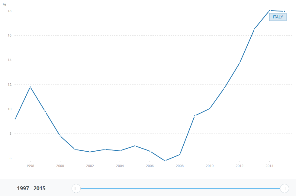
It’s clearly a problem.  Now let’s say Deutsche Bank is woefully exposed to this nonperfoming debt in Italy.  All it would take is a trigger like a major accounting fraud is discovered at Citigroup while derivative instruments begin crashing at Deustche and the counterparty massacre begins.

While this happens and to help allay fear, let’s say Japan and the ECB simultaneously co-announce deep cuts in their central bank interest rates of an additional -1.5% each.  At the same time, the ECB announces it is going to buy 10% of all European companies with market caps over $10B.  Additionally, the Netherlands announces their exit from the EU.  You think fear might start rising?

Let’s add another fear factor to the scenario, Japan announces it’s going to spend $1 trillion USD on infrastructure and technology development to create jobs but simultaneously announce a $27,000 USD annual living wage.  Economists call this “helicopter money” and it’s the last blank bullet Western central banks possess to stimulate animal spirits.

The scenario is extreme, but the world’s markets are dancing on a razor’s edge.  Do you see why gold sounds so sound?  Do you see why some exposure to precious metals could possibly help carry portfolios through the next crash?  Millennia of monetary utility.  Zero counterparty risk.  Accepted value around the world by all people.  Doesn’t sound so crazy to have exposure to the asset class, does it?

It’s just about quitting time so let’s address the two most important aspects of even knowing or sharing this information.  How is it actionable and in what kind of timeframe?

Well if you’ve read any of my material over the years, you should have a pretty good idea of how I think it’s actionable.  Increase cash levels.  Increase precious metals exposure via the physical metal and intelligent allocations into precious metals stocks.  For the latter, see the J-perp portfolio.  It’s a basket of junior players that in 2016 is outperforming virtually every index and hedge fund known to man.

Begin to pare back winning positions that are leveling off.  Going to cash means liquidating where appropriate in order to raise the cash.  Many of the world’s best value investors have started that process some time ago.

As for timeframe, I’m more convinced than ever that sometime in 2017 is when it all begins.  By begins, I mean the wobbling.  Like a top slowing its spin and starting to topple.  We may not see an outright initiation of a crash, but I’m confident that serious wobbling will begin.  I already believe that the action at the end of 2015 and beginning of 2016 was the start of everything.  That period of volatility was the waking up of the bear and the starting point for the last-gasp melt-up in markets around the world; the final blow off for profit grabbers.

Bear in mind that central banks control everything now.  Sentiment and liquidity via free market operations are a thing of the past…for now.  Which means that through their actions, many players believe that the universal bull market can continue for years.

I believe this to be flawed thinking.  When confidence takes its leave, there’s no amount of money that can be thrown at the issue.  There’s no amount of negative rates that can spur true economic development, because animal spirits will be neutralized by fear.  Banks and sovereign wealth funds will be monetizing even more ludicrous amounts of varying asset classes.  You thought it was crazy for central banks to start buying stocks and corporate debt?  Just wait.  Desperation will breed decisions that will go down in history.

It’s a fine line between pessimism and realism.  I’ve shared enough of both in this post and the last.  You’ve gotten useful charts.  I’ve provided what I think are some important points about how the financial system truly works.  Now it’s up to you to make key decisions for your own portfolios, because when the fun does stop, the amount of leveraged liquidity wending its way through the system will hasten a cataclysmic financial event.

All that being said, let’s ride the final melt-up for all that it’s worth and try to get paid.

I’ll leave readers with one final quote to sum up my thoughts on the complexity of the financial system.  It’s a pithy little ditty by a recognized genius and one of history’s greatest brains, Leonardo da Vinci.

“Simplicity is the ultimate sophistication.”  Here, Here.

Evaluating Markets Not Called Stocks

In my last financial post, I stated that I thought the market would move sideways for approximately 7 weeks before a catalyst would present itself to drive the market higher going into the beginning of the summer. So far, so good. Yes, the market is up about 1.5% but it appears to be the start of a sideways consolidation as the market exhales some energy.

I suspect we see a little downside move over the next week or two, as part of the sideways action, followed by a move back up to current levels about 3 maybe 4 weeks from now. By then, that catalyst should present itself for the resumption of the trend back up to new highs. Will my hot streak continue? If past is prologue…

clip_image001

Right now, I want to talk about the US dollar and its potential effects on various commodities. Specifically, we want to watch oil, precious metals, and the grains.

clip_image002

It’s easy to observe the stiff support at $94 and I think this time is no different. I suspect we get a slight bounce of about $4 up to about $98. This is in line with previous bounces off of $94 during this 15-month consolidation. There are plenty of analysts out there who think the USD bull will renew to move a lot higher. The thesis of the trade being a fear-based allocation in light of a pessimistic international outlook to various economies and the worthless, respective monetary policies currently employed by central banks.

I disagree. When the big one hits, the real correction across all markets, the USD will at first be a bastion of relative strength but that sentiment will be temporary. The problem with the thesis that we are in the early phases of a USD bull is that it runs counter to the other widely held thesis that the next financial crisis will be co-focused around an international collapse in confidence in the USD. That’s a discussion for a future post.

I believe the momentum has shifted for commodities. I suspect the worm has turned in the precious metals complex. Corn, wheat, and soybeans are potentially at the beginning of a spike. Oil has been unstoppable, but that DOHA meeting of the controlling powers will have a heavy influence on trading behaviors. It’s not inconceivable that the USD and commodities could run in the same direction but that belies decade’s worth of a consistently negatively correlated relationship.

Specifically, I’m referring to short-term action. Months not years. But let’s look at multi-year charts for gold and the grains, of which I’ll use my typical go-to trading medium of JJG.

Gold:

clip_image003

What goes up generally comes down. Gold has held strong with a sideways move off the hard spike higher to start the year, but with the pending move in the USD, I think we’ll finally see the correction that many have been calling for. You can see that around $1,140 represents a stiff area of support. I suspect that could be gold’s next destination over the next several weeks or months, however that still represents a higher-low leaving a new uptrend intact. If one were inclined to trade, that’s $100 of movement to design a short-term, multi-month play as it moves lower and then begins a recovery. One pattern to watch, if you believe in such hokum, is the little head & shoulders that has formed since February. Will the break of the right shoulder-base be a catalyst?

Grains:

clip_image004

I have had a lot of luck trading this grains ETF. Some of my biggest returns in the shortest amount of time have come from scalping the market for a nice rip on these multi-month grain rallies. Sentiment, professional hedging, and seasonality point towards the potential of another run. More importantly though, price action agrees. It looks like a based-low was established to start the year and last week represented a possible higher low. The price action was especially promising to end the week. Position accordingly.

But if the USD is about to bounce, won’t that hurt commodities? Even agriculturals? Not necessarily. Oil will very likely be affected but again the speculator positioning by huge players could potentially cause another squeeze as much as the DOHA meeting could negatively affect prices. Gold sentiment was stretched anyways. But the grains don’t always run counter to the dollar. In fact correlations between the USD and grains do not share an easily deciphered message. Grains can and do run in lockstep with the dollar at times. Have a look below.

clip_image005

In two of the last 3 rallies, the grains (blue-dotted) ran concurrent with the USD. Even though the USD is potentially beginning a bounce, so could be the grains.

As stocks continue their consolidation, the USD should be the dominant theme in the markets as it moves upward over the next several weeks. Watch associated commodities. If you’re feeling really brave, try trading the other currencies with a rising USD as your foundation for analyses. Good luck out there.

Should the Investing Public Be Worried if Some of the Biggest Banks are Genuinely Scared?

Questions of investing and speculating always require context within time-frame. Players in all asset classes, professional or not, approach the game from their own perspective.

Traders surfing the waves of volatility may be looking only days or weeks out. Investment managers overseeing a growth-oriented portfolio may be looking ahead months or quarters while a value-oriented portfolio manager may be looking years out. The 401k-watching worker bee may be wringing their hands at every market move and every ignorant headline despite the fact that they have 30 more income-earning years left before retirement.

The game is tougher than ever even for the professionals and it’s difficult to decide a course of action with the information overload coming at market players. Determining what’s noise and what is actually valuable information is critical in making the right moves within your portfolio.

I have long been pounding the table on building cash reserves while staying invested in the markets. I’ve also stated that I thought the downturn of late 2015 was the start of the next major bear market. I think that dip and recovery in 2015 was the bear waking up and the poor start in 2016 is investor realization of that bear. However, because everybody now sees it, the markets aren’t going to execute a full-frontal stage-dive. That’s not how these things work, right?

I think we get a recovery into new highs followed by another much smaller correction and consolidation potentially followed by another new high. After that, I suspect all the bull energy will be fully used up and the bear will begin in earnest. Remember, these are simply my suspicions based on behavioral observation of the markets; nothing more than forecasts of potential outcomes.

It’s been a long time since I’ve hit readers with some good old chartporn, but I’m in the mood to throw a bunch of squiggly pics out there to possibly help the reader better assess the market situation in 2016. Observe a 20-year, monthly chart of the S&P 500 along with some relevant indicators.

clip_image001[6]

Observe the long-term breakdowns in the indicators matching the actions of 2008 and 2000. Does that mean crisis is imminent? Nope, but I do think it reinforces my call that a new bear has started. Notice also in 2001 and 2008, we saw strong support and a bounce off of the 50-month moving average. Too many technicians are looking for that and thus too many algorithmic shops will be front running ahead of that signal, blowing out orders to drive the market higher.

I suspect this bounce we are currently in the midst of may be a bit stronger than people realize. Market players have been so used to the V-recoveries and yet they’ve already forgotten what they can be like. It appears that players are numb to the potential of a multi-week to multi-month V-bounce from the January 2016 lows. Despite what I surmise about a stronger than expected bounce, nobody can blame investors for either running for the hills or shoving their heads into the sand.

We’ve already seen the peak in net profit margins for this business cycle in the largest US corporates at the same time that markets continue to be overvalued, despite the corrective moves in December and January. Observe the following chart courtesy of ZH via Thomsen Reuters via Barclays. It depicts how the recession fuse has likely been lit.

clip_image002[6]

And with recession generally comes a bear market correction. Or is it the other way around?

Regarding overvaluation, have a look at this comparison chart from AQR depicting market returns based on various starting points of the Shiller P/E. AQR is the shop that Cliff Assnes, billionaire hedge fund manager, founded and runs.

clip_image003[6]

This coincides with GMO valuation models for future returns based on current valuations. There are plenty of Shiller P/E naysayers who believe that the indicator is bunk. The fact of the matter is that evaluating a normalized 10-year look at P/E ratios is a simple and intelligent way of quickly gauging valuation levels compared to prior periods. Of course every period in history possesses its own specific circumstances as the backstory of the valuation levels, but the raw Shiller P/E paints a clear picture for equity performance going forward.

Besides I don’t see or hear anybody calling Bob Shiller a dumb man. Despite what you may think of his ratio, Shiller is a respected academic even within the professional financial community.

Let’s take a look at a chart from one of every perma-bull’s favorite bear-shaped piñata, Dr. John Hussman. Unfortunately, Hussman catches a lot of flak. Less so after admitting to his analytical mistakes coming out of 2011 but I think he catches a bad rap for simply calling it how he sees it. Hussman’s analysis is based on a quantitative and thorough study of the markets. Can the same be said of a vast majority of the financial blogosphere? No it cannot, including myself. Observe the Hussman Hindenburgs. They nailed the current action coming into Q4 of 2015.

clip_image004[6]

The criterion of the Hussman Hindenburg is detailed in the upper left corner of the chart. Dr. Hussman’s Hindenburg indicators proved to be quite prophetic in 1999 while essentially nailing the top in 2007. For your own long-term holdings, ignore these signals at your own risk. Dr. Hussman, like Dr. Shiller, is respected amongst fellow financial professionals. Have a look at Research Affiliates’ (“RA”) own analysis on current valuation levels.

clip_image005[6]

In a research piece they published in July of 2015, RA evaluates the differences in relative valuation metrics (CAPE, Hussman, Tobin) and absolute valuation metrics. They came to the following conclusion.

Our answer to the question “Are stocks overvalued?” in the U.S. market is a resounding “Yes!” Our forecast for core U.S. equities is a 0.8% annualized real return over the next decade. The 10-year expected real return for emerging markets equity, however, is much higher at 5.9% a year. The return potential of the nondeveloped markets is so high, in fact, that the valuation models, warts and all, paint a very clear picture.

May want to rethink that lack of EM exposure going forward, depending on your time-frame.

Shall we move on to a couple of less orthodox indicators of potential trouble in the markets? Observe the two following charts which pertain to income as opposed to valuation or price action. In the first one, created by McClellan, we get an interesting correlation to total tax receipts for the US government as compared to US GDP.

clip_image006[6]

Notice that in 2000, the US crossed the 18% threshold and stayed there awhile before rising even higher at the beginning of the market selloff. For the GFC of 2007, America almost got to 18% but not quite and we still literally almost vaporized the entire financial system. Currently, we’ve reached 18% but that may or may not mean anything. In each previous occurrence, tax receipts stayed at the level for months or even years so this is an indicator worth watching but only in conjunction with many others.

Interestingly, federal tax receipts as a percentage of GDP currently reached 18% right before the markets began selling off last year. Repeat after me. Correlation is not causation, but the timing is still interesting.

The other chart that doesn’t get a lot of coverage but is very well known is net worth of US households and non-profit organizations as a percentage of disposable personal income. You can find it courtesy of our friendly Federal Reserve Bank of St. Louis and their FRED tool. The grey vertical bars in the FRED charts denote recessions.

clip_image007[6]

It’s been a clear indicator in 5 of the last 6 recessions and we also had that annoying fakeout in 1987. Much like the prior graph, this particular chart should be coincident with additional economic indicators if one is attempting to forecast potential economic as well as investment outcomes.

I want to move on to a particular area that everyone should be concerned about and that is nonperforming loans (“NPL”) at major banks. Not just at US banks but around the world. China’s commercial banks have raised fear levels in even the most seasoned professional investors due to their NPL levels increasing so drastically in 2015. I’ve long stated how debt levels in Italy have the potential to dismantle a good portion of the financial system because the Mediterranean Boot is such a key economic cog in the European Union. Some of the biggest commercial banks in Italy are on the verge of toppling during a period where now the ECB is less amenable to the previously used “bad bank” options. The pressure is beginning to mount for Italy’s leadership to formulate a strategy around potential bank failures.

You might be inclined to observe the following chart and think all is at least well for the US.

clip_image008[6]

But take a look at the following chart in commercial-only loan performance and begin to understand why the total situation looks toppy from the economy to the markets.

clip_image009[6]

For the record, commercial loans comprise approximately $2 trillion of the outstanding debt within the banking system. It is clear to see that a bottoming and an upturn occurred before the last 3 recessions and market dislocations. Now we are currently in the early innings of an upturn in NPL. If commercial loan performance behaviorally adheres to what we saw in the prior two recessions, we will see at least an additional 2% of total commercial loans become impaired assets. That’s potentially between an additional $40 billion to $50 billion at minimum that banks will have to provision for. No easy task in light of current leverage levels and collateral utilization across the repo and derivative space.

This is especially concerning because of the systemic importance of each bank to the entire financial system. Just look at the consolidation that has occurred since 1990.

clip_image011[6]

Couple this concentration with a lack of regulation allowed by Gramm-Leach-Bliley and you can see that debt impairment at the banks is not going to have a happy ending. And if you think Dodd-Frank was the answer to all of our problems, I might stop laughing sometime in March.

What would work to alleviate a lot of the financial pressures around the world in the short term is a weaker dollar. I don’t say that as a proponent of a weaker dollar. Rather, I am stating that currency exchange due to a weaker USD could help sugarcoat revenue reporting across international corporates. It would relieve pressure in the management of reserves for countries with an excess of US treasuries. The oil price could stabilize temporarily but it is well-documented that abundant supply and less-than-expected demand is still the story. Commodities could lift and thus commodity producing countries who are already fighting with their reserves issue could see a double-positive impact. All these effects would be temporary as world debt levels are at unsustainable levels and a bear market for all assets has potentially already arrived. It just has yet to completely sink its claws and fangs entirely into the world’s financial system.

Coming back to the initial question behind this post. Should the investing public be scared? Maybe not scared. Let’s call it aware. They should be aware of all the happenings that are occurring right now. Cash levels should be raised. Certain assets should be paired down depending on losses, gains, and risk exposure. More importantly it’s time to take stock in your own investing psyche. If you are building cash levels, will you have the courage to act at the appropriate time? That’s what raising cash boils down to. Do you have an understanding of the intrinsic valuation levels of specific asset classes that will motivate you to put cash to work?

Aside from brushing up on your ability to properly assess valuations, take a look inside yourself and evaluate your ability to deploy cash when fear is running rampant and the nadir of multiple markets appears to be nowhere in sight.

clip_image013[6]

Indicator Currencies

A couple of weeks ago on ZeroHedge, I happened to read a chart they nicked from BofA Merrill Lynch. Observe:

clip_image001

And just to be Captain Obvious, the chart is inverted as the South African Rand is not exactly a bastion of strength in light of the continued run on commodities. Inverting a chart allows for an alternative perspective, which we know is needed more than ever in these days of literally any trading edge being arbitraged into oblivion within a co-located microsecond. We’ll have to wait and see if Rand correlation to world markets continues to lead up to major market events, but there is no denying the importance of currency analyses in a macro outlook.

Speaking of Captain Obvious, this inverted Rand chart made me want to take another look at an inverted chart of the USD. I keep reading perspective after perspective about how the tightening of the US currency will lead to continued strength in the dollar as the US continues to be the strongest developed economy in the world. Safety, safety, safety will drive the USD trade according to expert analysts. This is in light of the fact that trader commits have already been showing some backing off in the long USD trade.

I am by no means an expert in currency trading, or for that matter, examining international capital flows. However, I pulled up an inverted monthly chart of the USD over the last 15 years and included a couple of indicators that I rarely use. The top indicator is the standard Ultimate Oscillator (ULT) with default periods of 7, 14, and 28. The bottom indicator is simply the 9-month of Rate of Change (ROC). There were some potentially telling relationships.

clip_image002

As denoted by the green circles, trouble was usually on the horizon once the ROC worked its way up to 10 or higher and then back down to crossover the zero-line. The lone exception over the last 5 occurrences was the late 2012 to early 2014 consolidation with heavy chop. Recently, the 9-month ROC just began to crossover below the zero-line again.

The ULT follows a similar path in that once it has breached a reading of 60 or higher and then began to work its way downward, USD price action generally began to deteriorate. Observe the price action in the dollar at each of the downward sloping blue arrows.

Despite what the indicators have proven to communicate on previous occasions, this is an obvious case of data mining and thus cannot be truly relied upon for making large scale investment decisions. None the less, I found the observations interesting as part of a larger overall analysis.

There are many highly-correlated relationships recognized between currencies and asset classes. Some of the obvious ones are the USD and commodities (inverse), CAD and AUD and commodities (direct), Yen and SPX (inverse), but it’s the dollar’s relationship with the Swiss Franc and gold that has me intrigued for a potential move.

The franc and gold have a long documented relationship of synchronous movement. Not perfectly, but with consistently high correlation. While the dollar tends to move opposite the franc and gold. Again, not perfectly but with consistent negative correlation. Observe this time-tested relationship for yourself.

clip_image003

Could the action be telling market players to expect some fireworks in the USD, franc, and gold in the first half of next year? There are a multitude of low-risk ways to go long or short the currencies using futures, ETFs, and options. I leave it up to the reader to decide how to potentially risk any capital.

Another relationship to watch out for due to USD correlation, is the ratio of the S&P 500 index to the CRB commodities index. Kimble Charting Solutions pointed out the “Eiffelesqueness” of this particular ratio. With the world economy continuing to slow down, it does appear as if there is no hope for iron ore, oil, and copper but we are at multi-year extremes and a close eye is warranted. They’re called counter-trend rallies and the adroit can exploit.

clip_image004

I hope you had a wonderful Christmas and I sincerely wish that 2016 truly brings good tidings to all Margin Rich readers…and profits, too!